
Berco's
Packaging
Design
A field researched, prototype tested family meal takeaway box for Bercos where a kitchen visit shaped every structural and visual decision.
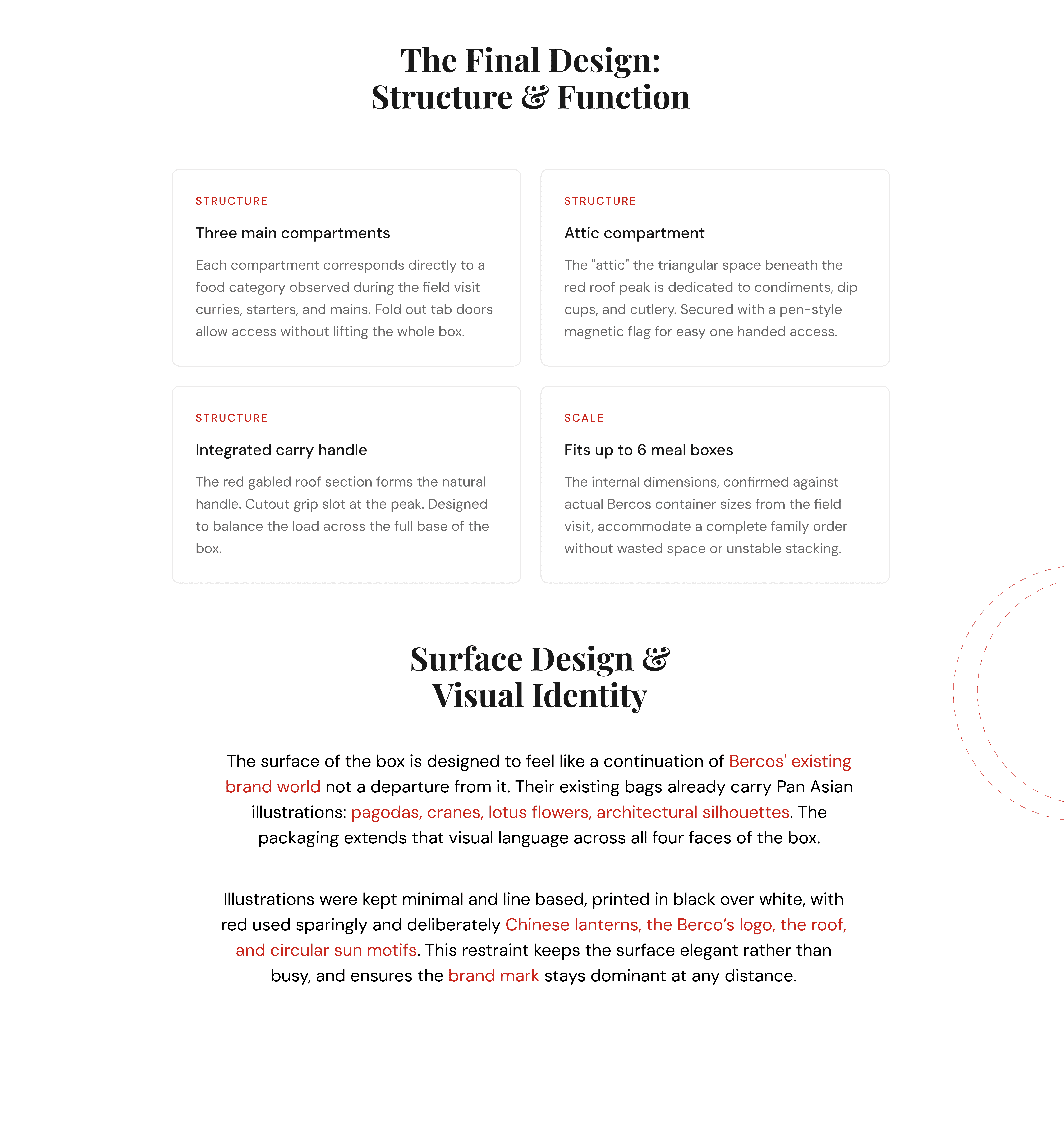
From Concept to Structure
With a clear direction established, we transitioned into shaping the visual language. Drawing inspiration from minimalist architecture and natural materials, we developed a system of design elements that balanced precision with warmth. Every component — from grid structures to iconography — was crafted to reflect the studio’s thoughtful, measured approach. The typography system emphasized clarity and timelessness, while the restrained use of color grounded the brand in its earthy, authentic essence.
The website was envisioned as a seamless extension of the brand’s identity — functional, elegant, and immersive. We designed a digital experience that prioritized spaciousness, intuitive navigation, and a strong visual hierarchy, allowing the studio’s work to take center stage. Motion and interactivity were used with intention, reinforcing the sense of calm confidence established during the discovery phase. The final result is a brand and platform that communicates quiet sophistication, structural integrity, and creative clarity.
Packaging Design
Prototyping, Illustrations





Built, Printed, Tested
The surface wraps Berco's Pan Asian world across every panel linework illustrations, red lanterns, and Hanyi Senty Pagoda as the typeface, chosen because even the letterforms carry the cultural identity. A working prototype was built and handled to confirm what the screen couldn't: that the grip holds, the compartments open cleanly, and the box feels as considered as it looks.
(View my other project)


